I got my first freelance job as map designer in 2016. The results were published 2017 in Early Christianity in Lycaonia and Adjacent Areas: From Paul to Amphilochius of Iconium by Cilliers Breytenbach, Christiane Zimmermann. The depict the ancient region of Lyconia in southern Anatolia.
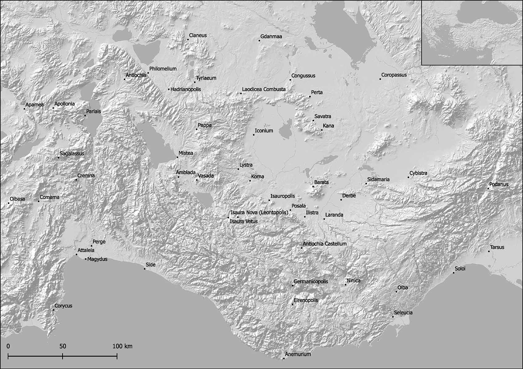
The work consisted of the overview map shown above and 12 detail maps. To use a black and white scheme was requested by the client. Luckily the information density was quite low so the reduced color range didn’t obstruct the map´s readability. The focus was on visualising the relation between the settlements and the landscape in which they were set.
All maps presented on this page are fabricated in QGIS. For more intricate details of the labels i use Photoshop. The depiction of the landscape is based on Digital Elevation Models, usually i use the SRTM dataset, and refined with a hillshade visualisation.
The following map was designed for another Freelance job in 2018 and published in Stephen Mitchell and Philipp Pilhofer (eds.), From the Margins to the Mainstream: The Emergence of Christianity in Asia Minor (Leiden: Brill, 2019). They depict Anatolia under Roman rule in the early years of Christianity.
As a little sidenote, note how the administrative region covering the West of Anatolia is named “Asiana”. The name “Asia” for the continent actually derives from a description of Anatolia, attributed to Herodotus (about 440 BCE). In opposition to that, the origin of the word “Europe” likely derived from the Sumerian (Sumer was a civilisation in southern Iraq in the 5th millenium BC) word “Ereb” or “Yurub”, meaning the land of the setting sun.
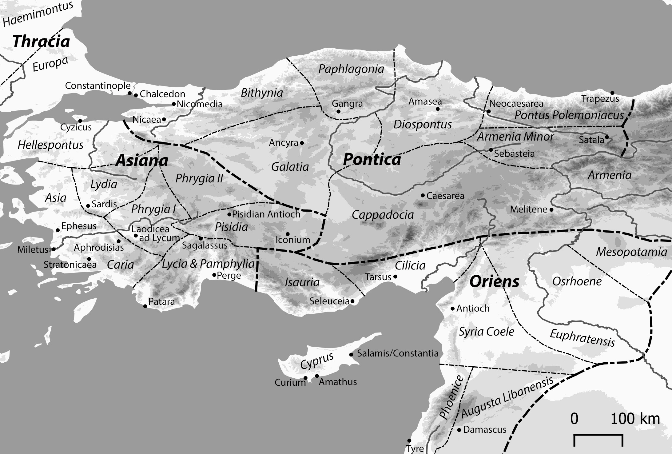
Again, the black and white color scheme was requested by the client. The challenge here was to integrate quite a lot of information and to visually differentiate between names of settlements from those of administrative regions.
The following maps were also done in 2018 and will be published in Julien M. Ogereau, Early Christianity in Macedonia (forthcoming). They depict regions of Greece during the early centuries of Christianity.
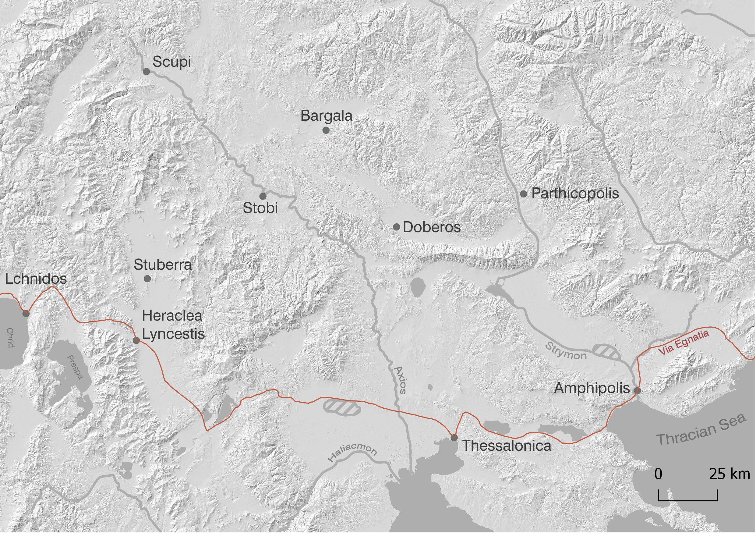
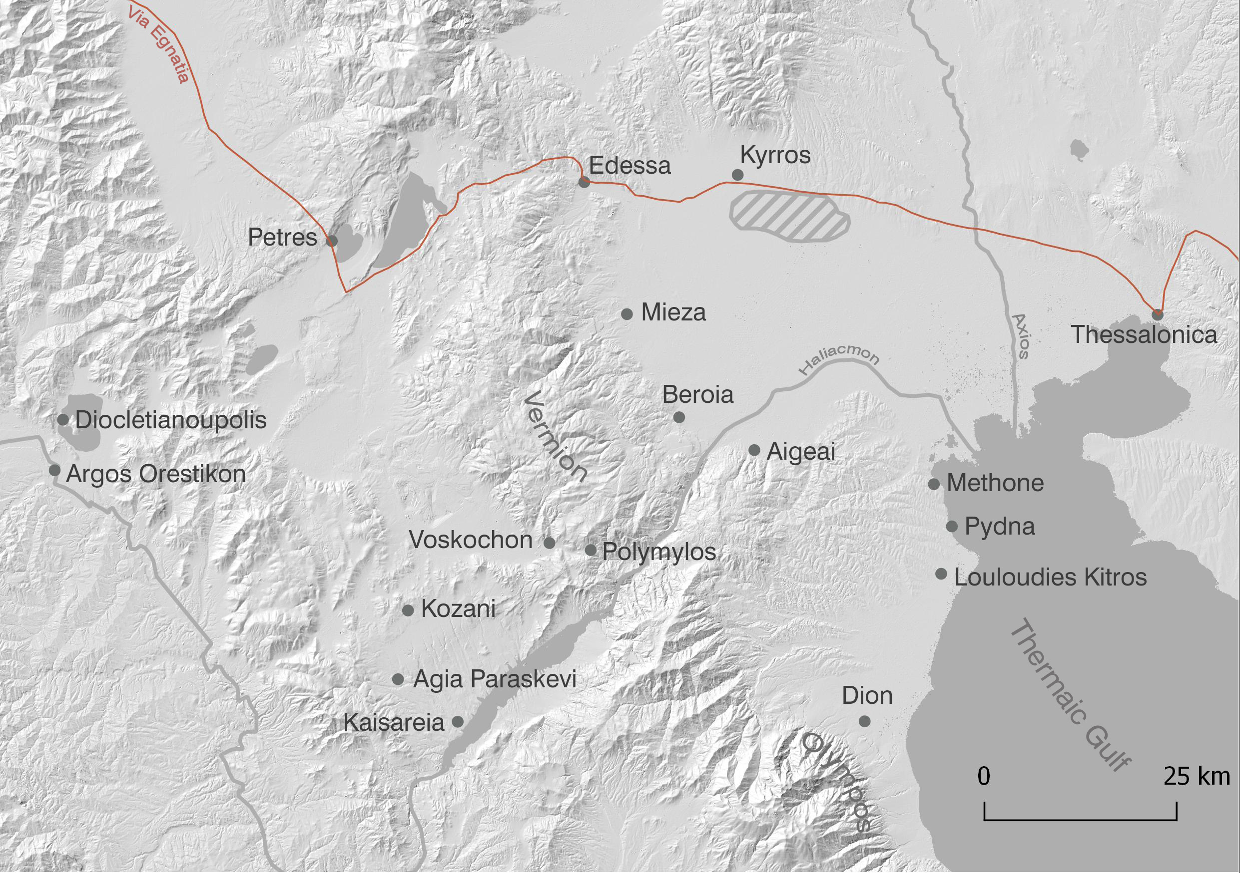
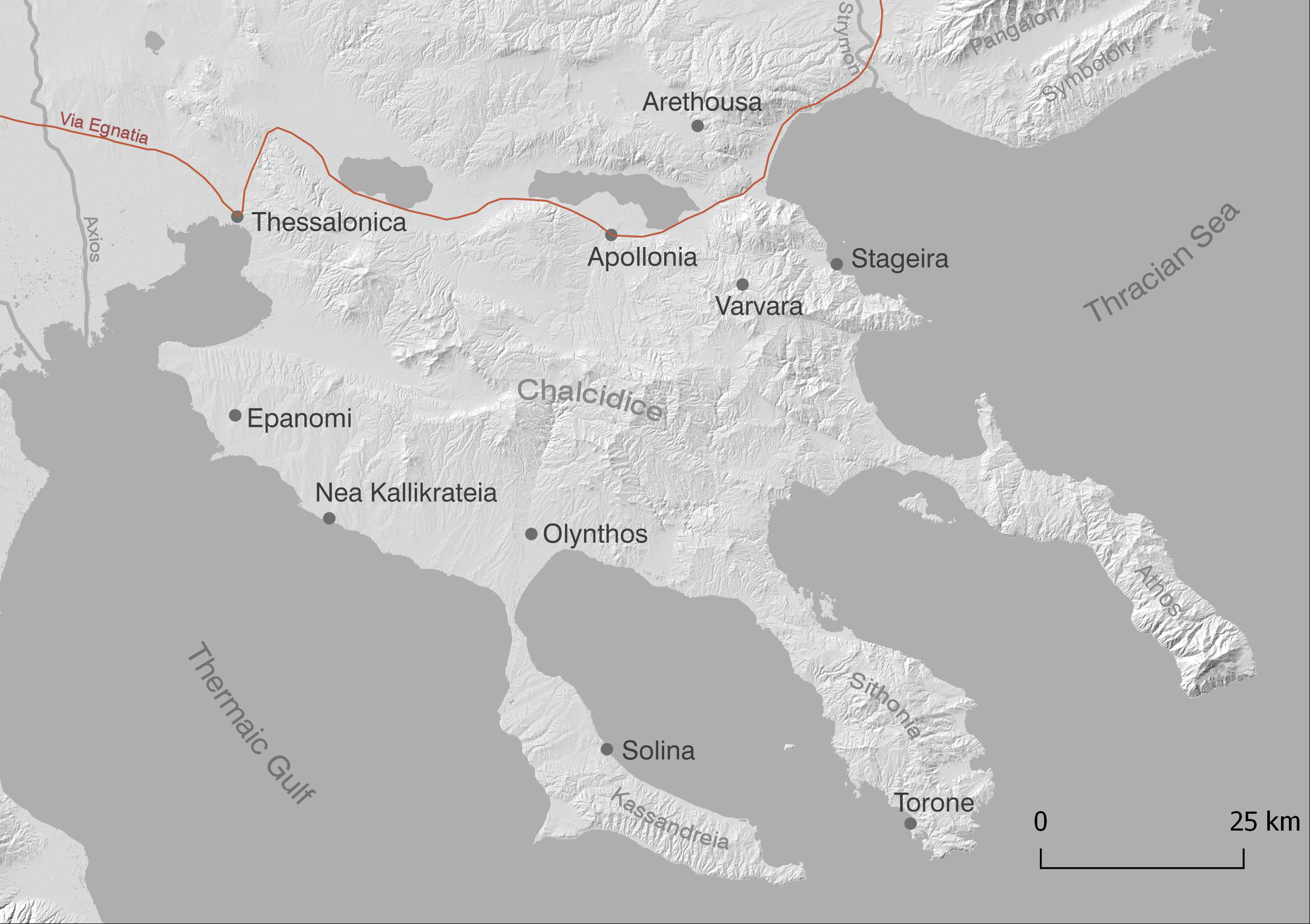
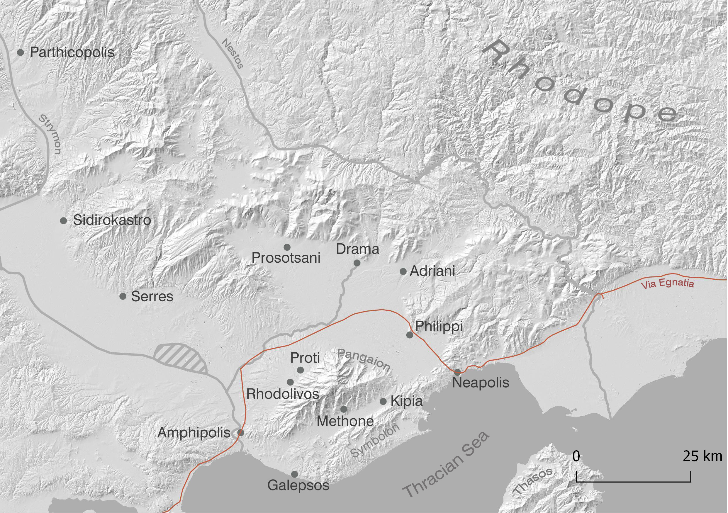
Also here the black and white color scheme was requested by the client to reduce printing costs. I present here early drafts which still include colors because they illustrate nicely how you can set a strong visual focus with only a subtle use of colors.
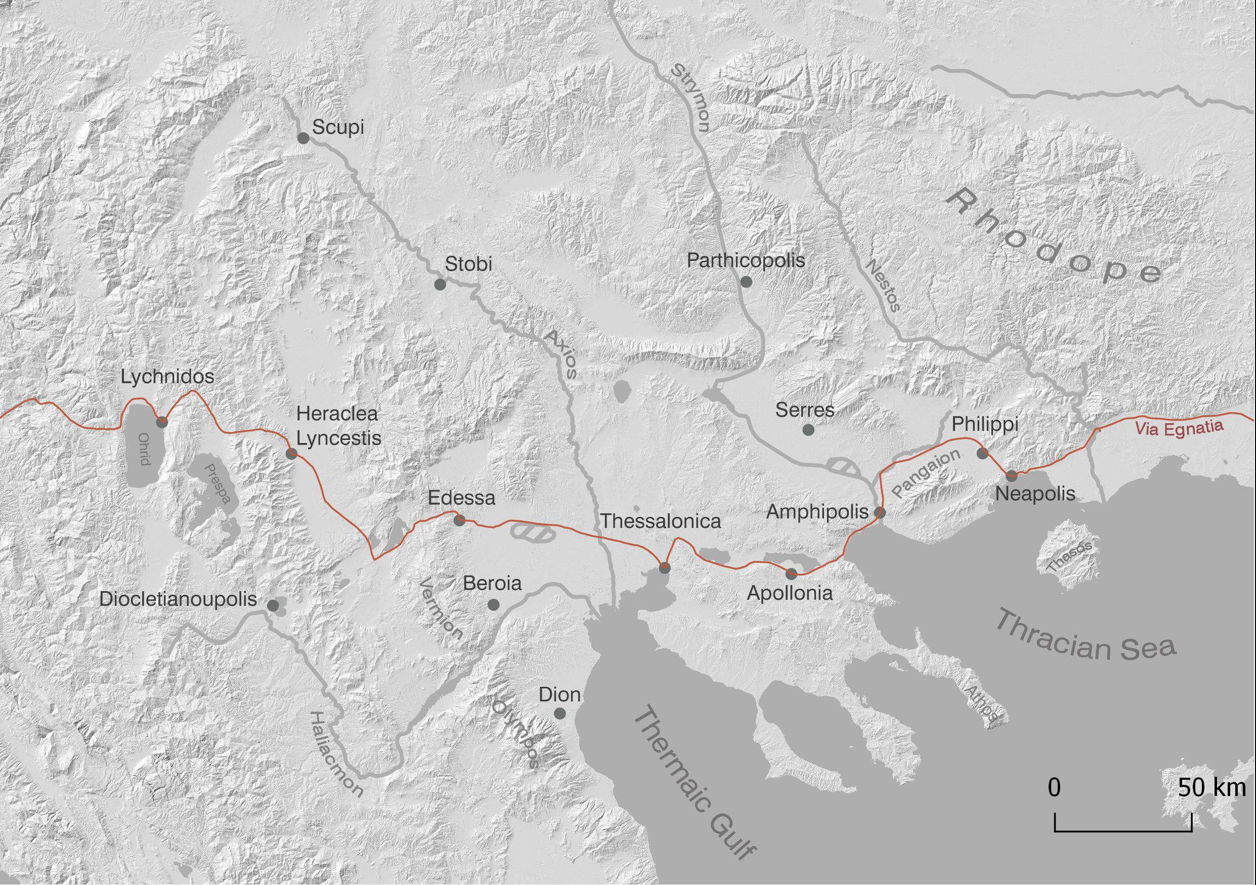
The following map is part of the final batch and will appear as it is in the final publication. I set this example aside because it illustrates how abstract information can be visualised in a map.
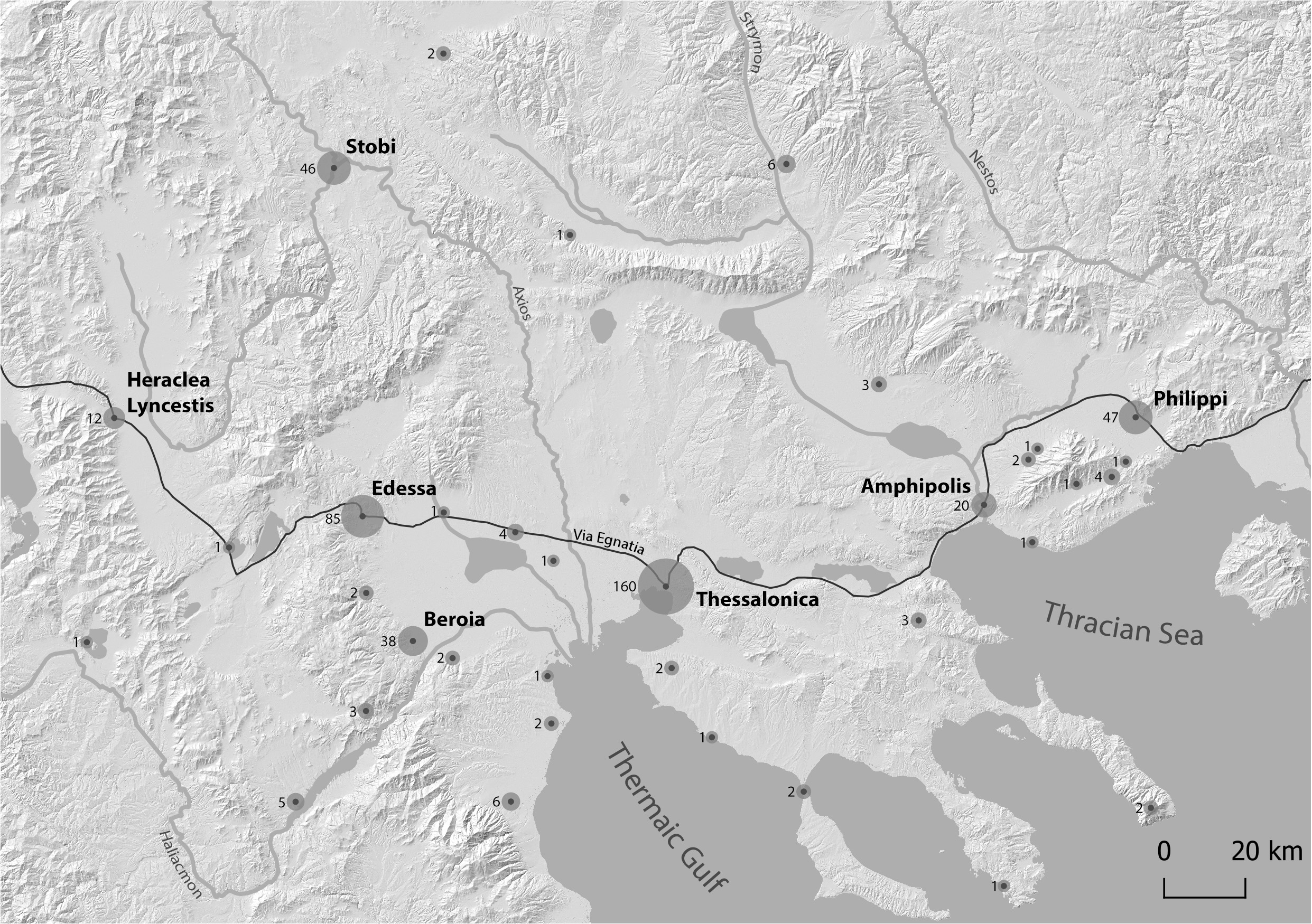
The map’s purpose is to illustrate the correlation between settlement’s proximity to the Via Regiana, an important Roman road in the region, and the amount of written sources relevant to the study.
Initially the client intended to publish the map only with toponyms aside to a table listing the amount of written sources. I suggested to combine both information in the map and came up with this solution. The amount of texts is visually represented by the size of the circle. The reader sees upon first glance that the biggest circles belong to settlements that lie along the route. The correlation does not have to be explained in the text. It becomes self-evident.
This map does what a good map should do: instead of simply illustrating, it communicates an understanding of space.
In my Master Thesis i finally had the chance design an entire map atlas by my own standards, that is at the very least to use colors.
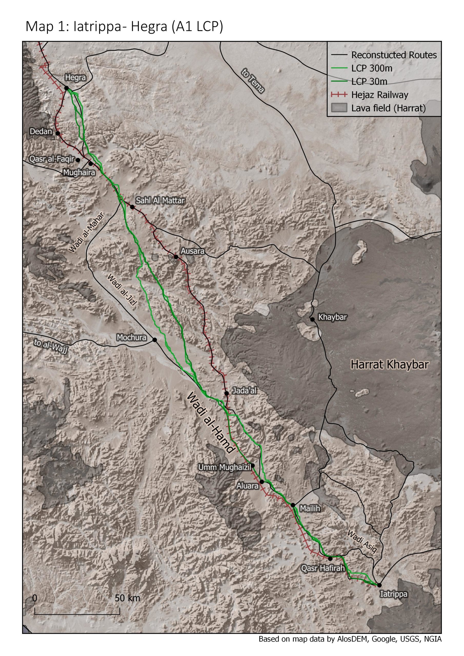
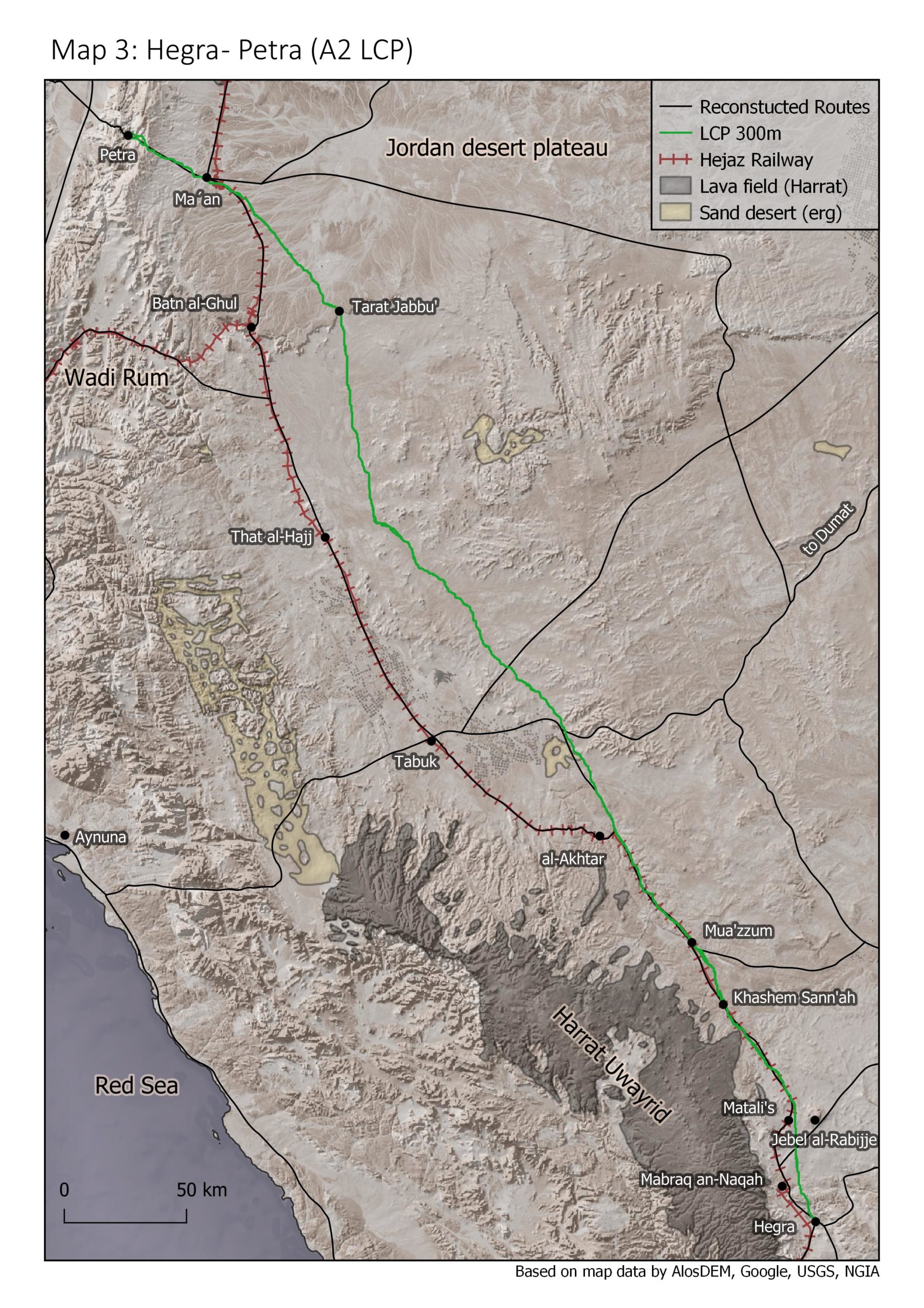
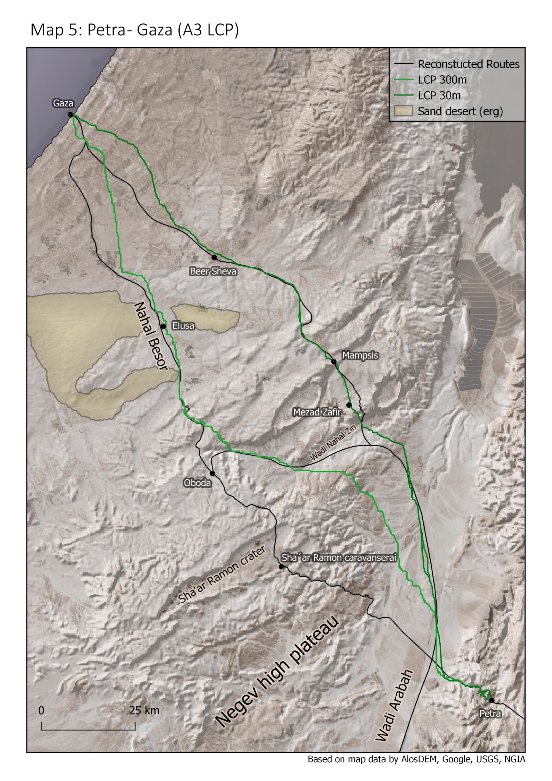
I have used a combination of sattelite imagery and semi-transparent hillshade models to combine notions of plasticity and realism. The result is a map that gives the reader a naturalistic impression of the landscape while communicating the importance of landscape characteristics like elevation in a way that satellite imagery couldn’t do.
Admittedly, these maps are not easy to read without knowing at least the basic outlines of the analysis i performed but it was not the goal to make them universal. Their target audience is the reader of my study. To get a quick introduction check out the page about my Master Thesis.
The maps illustrate how trade routes roughly correlate to the corresponding Least Cost path and how they avoided difficult areas such as dune sea deserts, lava fields and mountain ranges. That means cost efficiency was a prime influencer on the people that materialised those routes with their actions. Divergences, or in other words detours, happened only to reach certain settlements. The maps also illustrate how the course of the Hejaz Railway correlates extremely closely to our best estimates of the ancient trade routes. This hints to a bigger conclusion: traffic corridors on the Arabian Peninsula are in some ways universal and often have been used from the Stone Age until present times.